Colors Trends 2027
Find harmony
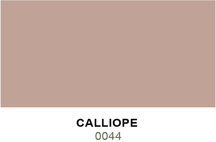
Color of the year 2027 N° 0044: Calliope

PAINT COLOUR TRENDS 2027
Micca Paint is a member of the International Color Guild. This group meets and provides its members with a forecast of 22 colours. Forecasting popular trends for painting colours really isn’t complicated. Trends follow a cycle and there is a progression of colours that coordinate well with each other.
Colour marketing designers from various manufacturing fields meet at annual conventions like CMG (Color Marketing Group) These meetings are important because the ‘Right’ colour sells……The manufacturers of textiles ( linens, fabrics, carpets, clothing) plastics, metals and all the goods we purchase like to produce products that complement each other. These trends are decided about 3 years before they are seen in our stores.
Find Harmony at Home with our Color Trends 2027 - two inspiring palettes that reflect how we want our homes to feel today. From bright and uplifting to calm and comforting, each distinct collection offers a unique path to creating spaces that celebrate positivity, foster connection, and help us find joy.
.
Find Calm and Harmony

Discovers news colors
In our 2027 colors trends
Harmony at Home
Home has become more than a place to live—it has become where we reconnect with ourselves, with the people we love, and with the moments that matter most. In a world that often feels fast-paced and ever-changing, our 2027 Color Trends celebrate the desire to create spaces that nurture wellbeing, encourage meaningful connection, and provide a sense of balance in our everyday lives.
Our 2027 Color Trends explore two distinct color stories that arrive at the same destination: spaces that foster harmony. Whether through uplifting energy or quiet restoration, each palette offers a pathway to creating spaces that feel deeply personal and genuinely welcoming.
The six colors in the Feel Joy at Home palette embrace life's brightest moments through colors that inspire connection, creativity, and celebration.
The six colors in the Feel Calm at Home palette turn inward, drawing inspiration from nature and quiet rituals that restore balance and encourage reflection.
Whether gathering with family and friends or savoring life's slower moments, our 2027 Color Trends remind us that our homes are more than the backdrop to our lives—they are places that shape how we feel, how we connect, and how we find joy.
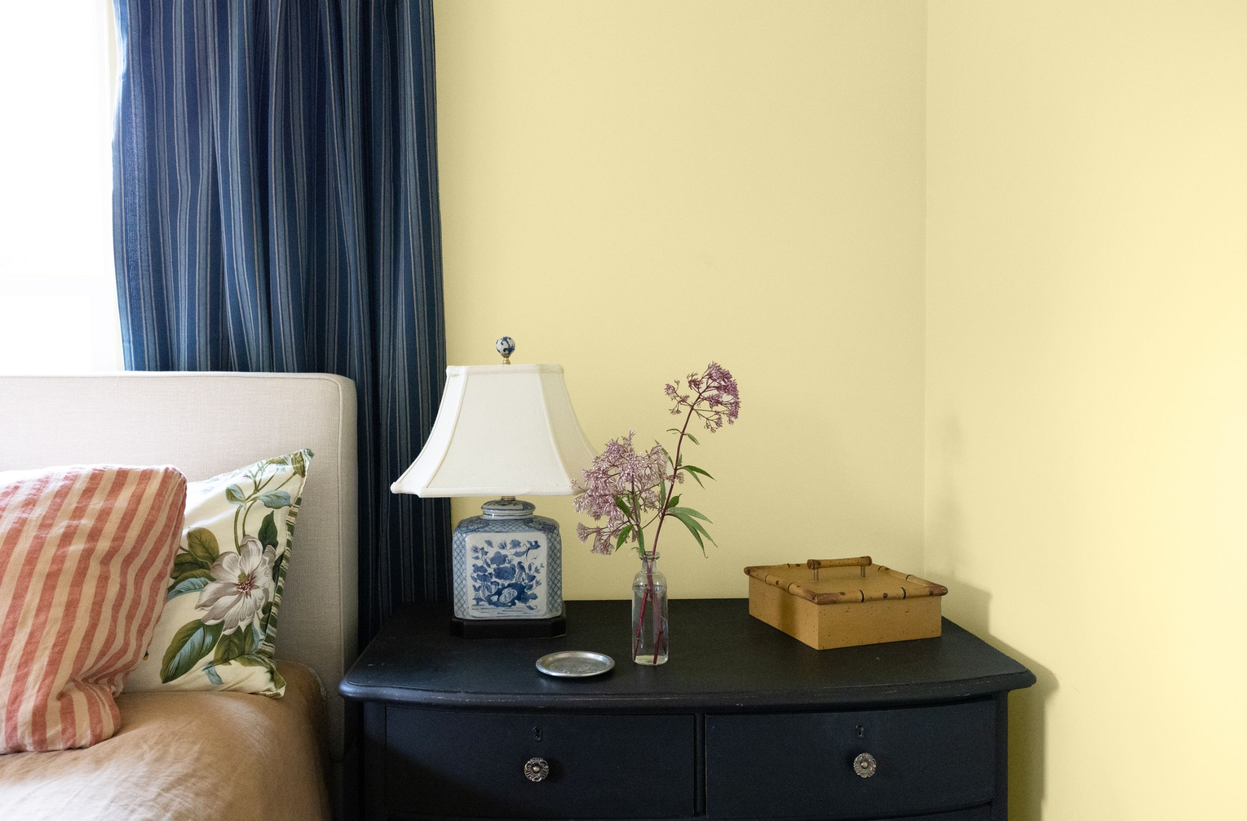
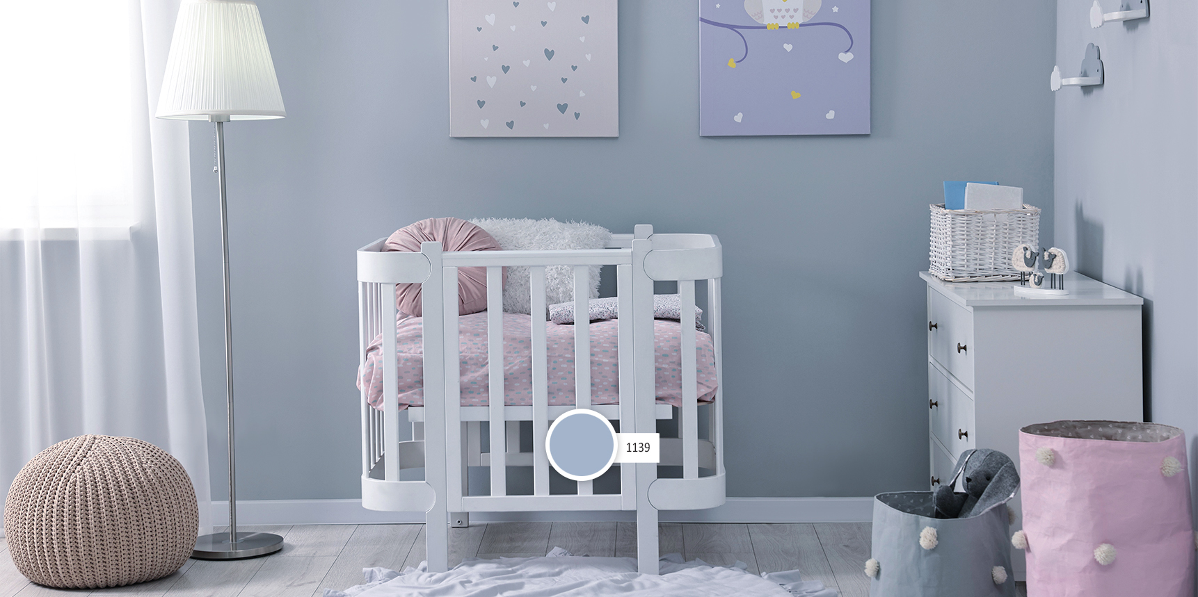
Feel Joy at Home is designed for the spaces where people naturally gather and connect. Cheerful yellows and playful pinks brighten kitchens, breakfast nooks, dining rooms, family rooms, and creative spaces, filling them with happiness and optimism. Airy blues bring freshness to bathrooms, bedrooms, and coastal-inspired interiors. Saturated blues blur the line between indoors and out, making them ideal for sunrooms, patios, and exterior accents. Whether used on cabinetry, statement front doors, furniture, or entire rooms, this versatile palette creates homes that feel welcoming, energetic, and full of possibility - inside and out.
Color Palette
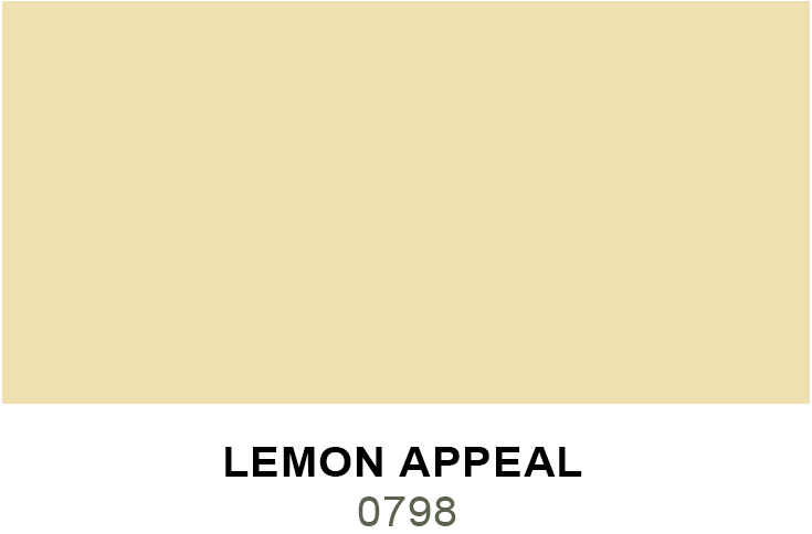
Lemon Appeal | 0798 Lemon Appeal is a muted, mid-tone yellow with a whisper of green.
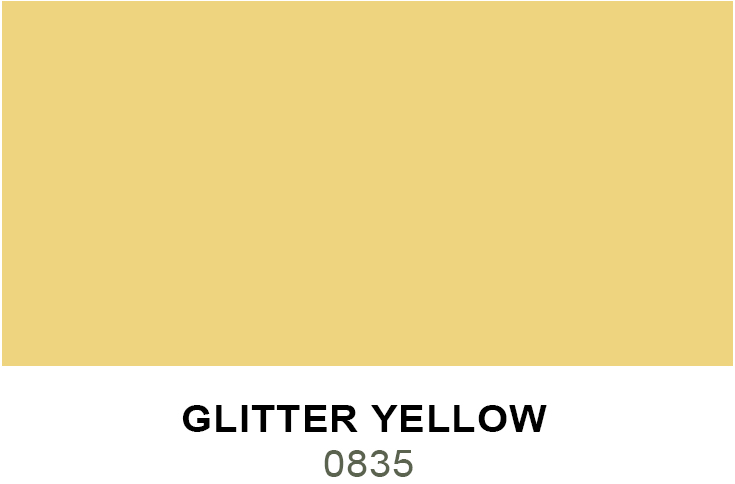
Glitter Yellow | 0835 Glitter Yellow is a bright, sunny yellow with youthful charm.
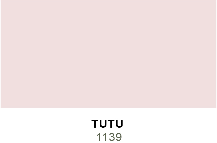
Tutu | 1139 Tutu is a pale pink reminiscent of a ballerina's leotard.
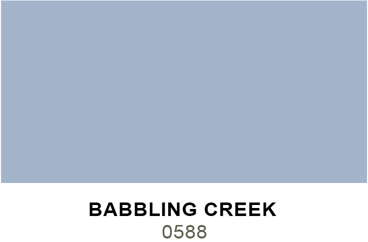
Babbling Creek | 0588 -Babbling Creek is a medium, blue-violet softened with gray.
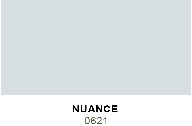
N u a n c e | 0 6 2 1 Nuance is a serene, light blue mixed with a touch of calming gray.
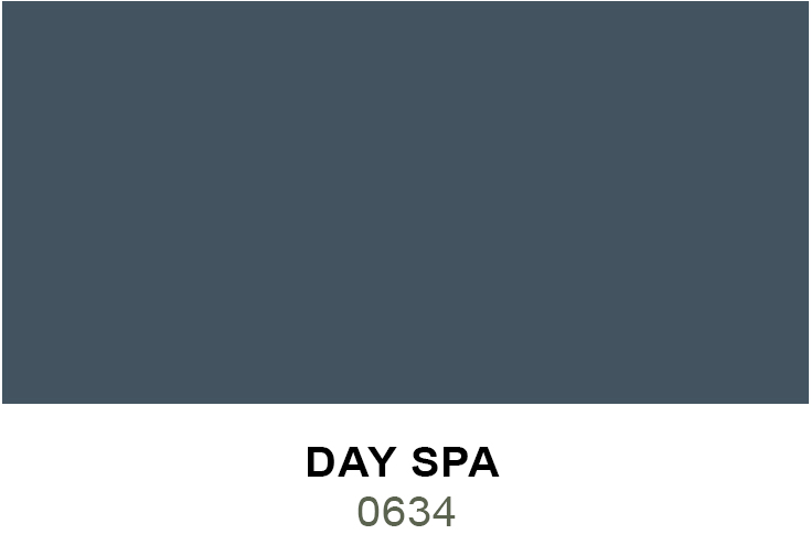
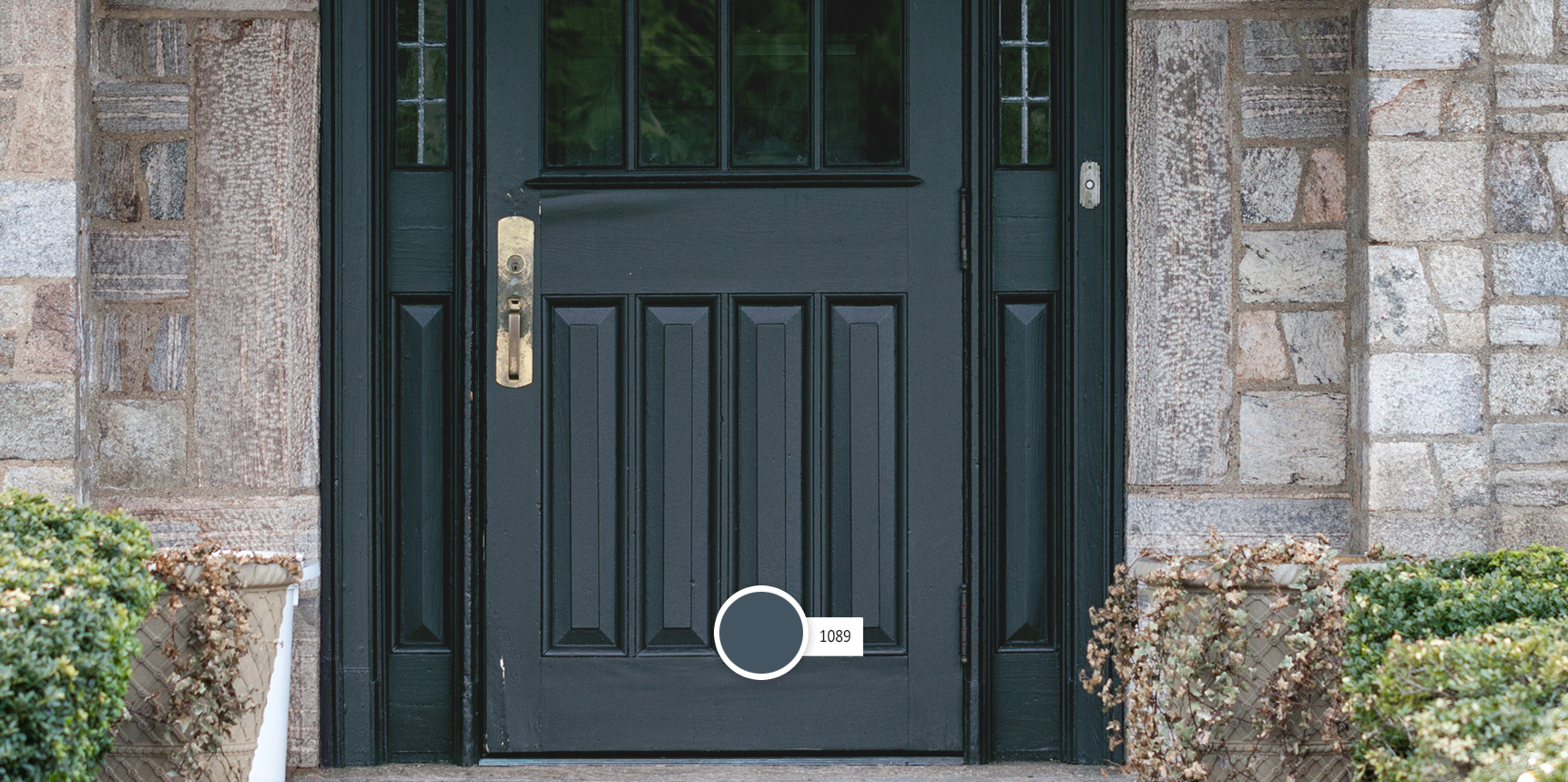
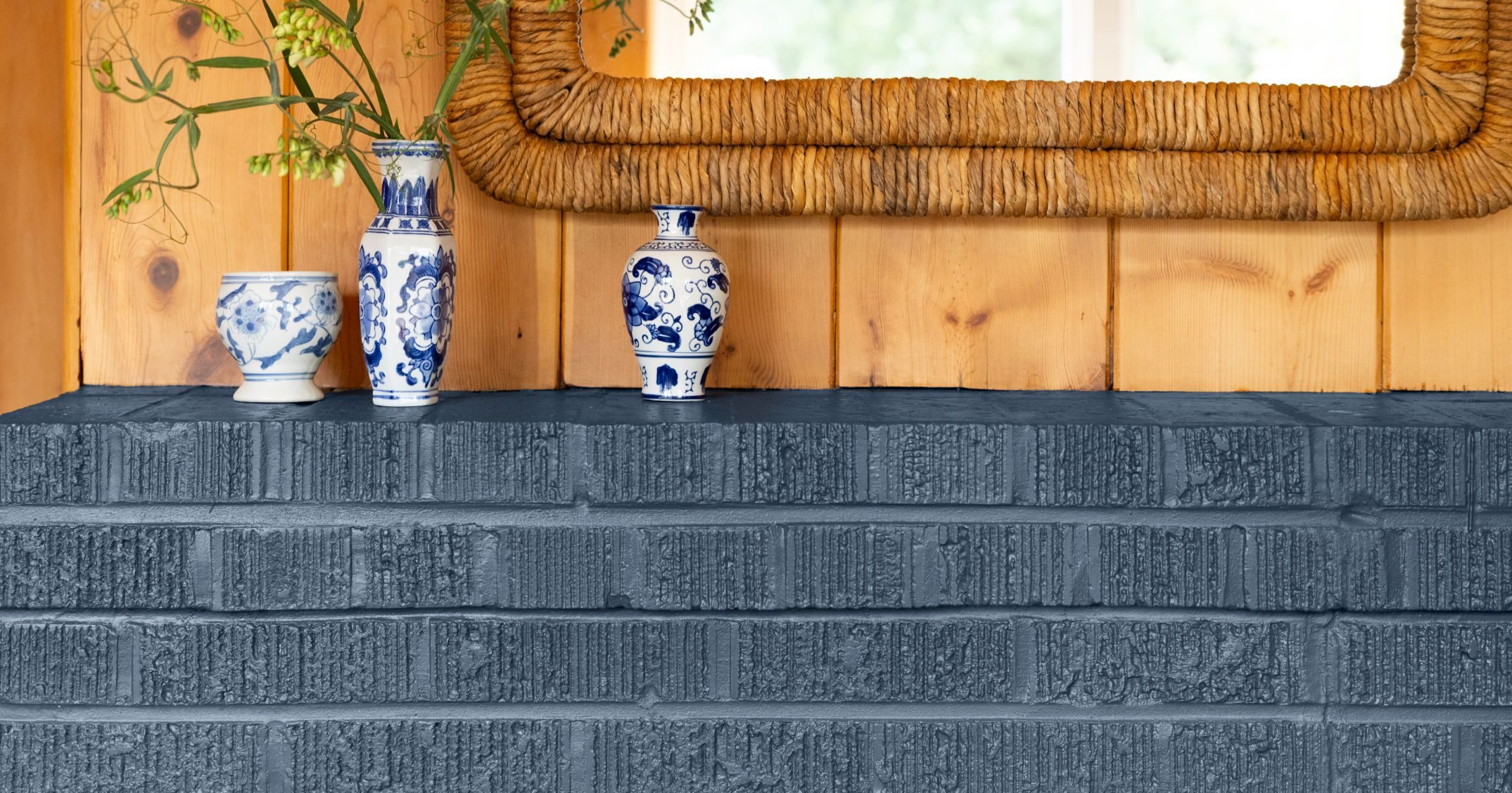
Day Spa | 0634 Day Spa is a deep, relaxed, indigo blue.
Colors Mix of 2027
Here the trends for calm colors
Feel Calm at Home
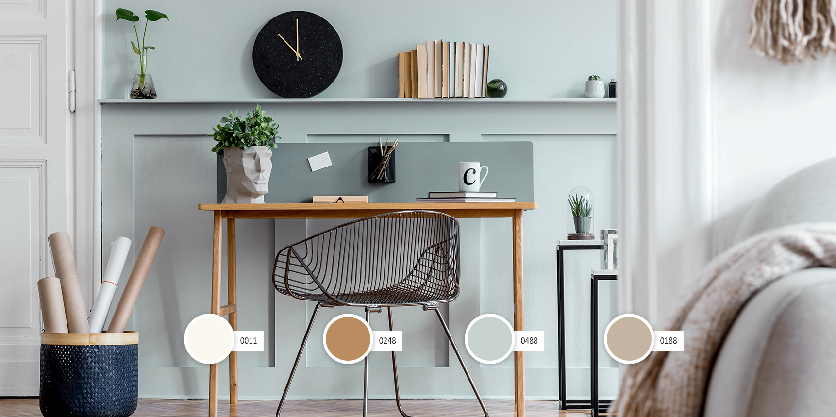
The Feel Calm at Home palette finds inspiration in nature and the quiet rituals that help us slow down and reconnect with ourselves and the world around us. Influenced by peaceful walks through the forest, reading by the window, creating with our hands, or tending a garden, these colors layer warm neutrals, soft mineral whites, earthy greens, and comforting pink and berry hues to create spaces that encourage reflection, restoration, and lasting comfort.
Rather than asking us to do more, the Feel Calm at Home palette reminds us to simply be present. It celebrates the beauty of slowing down, embracing meaningful rituals, and creating homes that feel grounded, restorative, and deeply connected to nature.
Design Inspiration
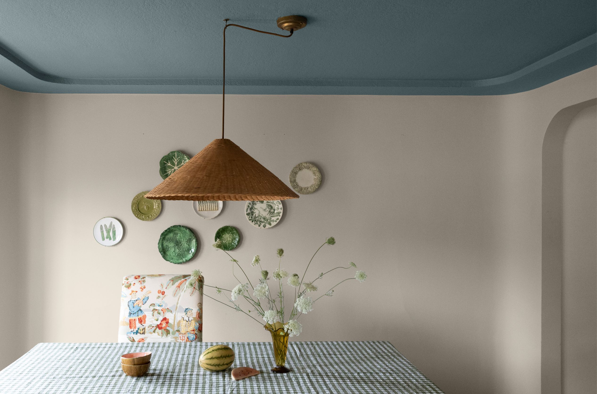
Inspired by peaceful walks in nature and the quiet rituals of everyday life, the Feel Calm at Home palette embraces spaces that feel grounded, warm, and comforting. Bring in natural materials like stone accents, woven textiles, and warm wood furnishings to create a home that feels personal and lived in. Energize the neutral tones in this color grouping with deep red or muted pink accents to mimic berries on a bush bursting with fruit or wildflowers dotting a field.
Where to Use
Living Rooms, Bedrooms, Libraries, Dining Rooms, Exterior Schemes
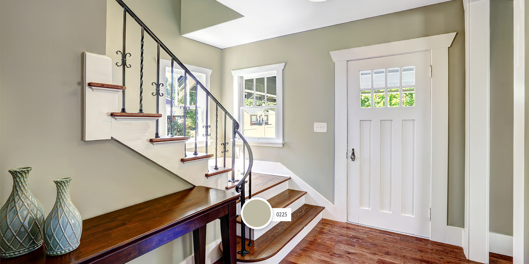
Feel Calm at Home is designed for spaces that encourage rest, reflection, and everyday wellbeing. Warm neutrals, soft golden hues, and muted greens create a calming vibe in living rooms, bedrooms, libraries where serenity is sought. Add a coloristic surprise on kitchen cabinetry or dining room walls with an earthy red and cozy pink. This easy-to-use palette can transition seamlessly from interior walls to a whole-house exterior palette that feels grounded, comforting, and beautifully lived in.
Color Palette
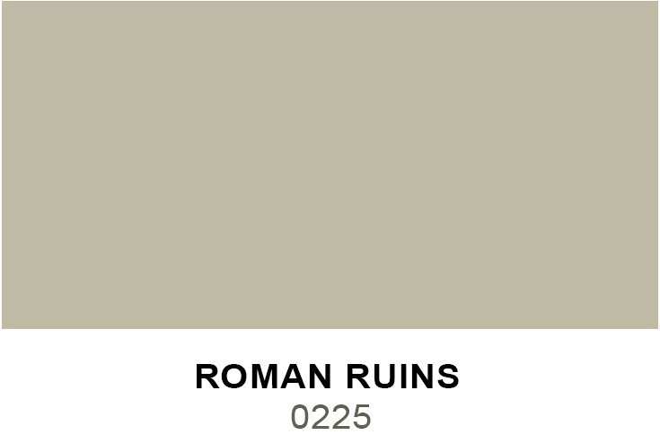
Roman Ruins | 0225 Roman Ruins is a rich neutral with green undertones and warm patina.
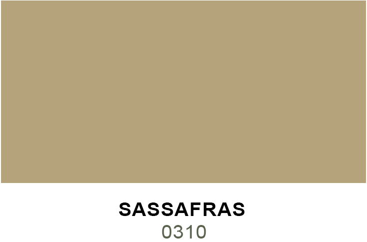
Sassafras | 0310 Sassafras is a warm, medium gold with a touch of tan.
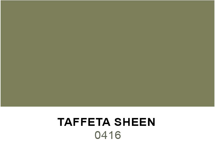
Taffeta Sheen | 0416 Taffeta Sheen is dark green, warmed with energizing yellow influences.
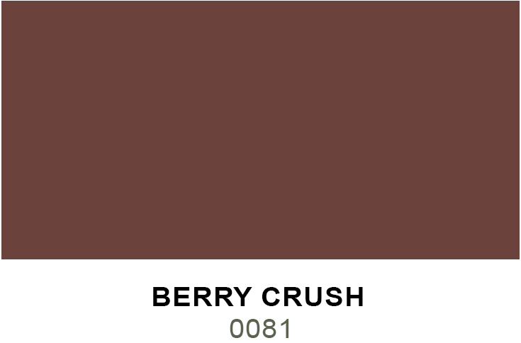
Berry Crush | 0081 Berry Crush is deep red, balanced with a touch of brown.
Calliope | 0044 - Calliope is an earthy pink grounded with a bit of brown.
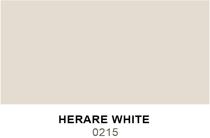
Herare White | 0215 - Herare White is a rich, grayed cream with subtle peach undertones.
Need some inspirations ?